Showing posts with label Tourism. Show all posts

Friday, February 8, 2013

The Old Dominion.

Here are some suggested route marker signs for Virginia. The present State Primary route markers are a kind of rounded shield in a black square, and the State Secondary is the boring circle sign.


Here's the present Primary route marker.
(Grey represents sky, which is typical throughout)


This one can be for limited-access free roads like Quebec's Autoroutes.


This one can be for toll roads.


This one can be for the Primary roads.


And this one can be for Secondaries.


Thursday, February 7, 2013

The Magnolia State.

Remember when Mississippi had the Magnolia auto registration plates? Well I think the state ought to model its route markers after it. In my suggested scheme, the surround and numerals are blue, and the magnolia is a green, yellow and grey watermark. I think it would be great for tourism.


One and two-digit.


And three digit. 
(1xx 3-digit signs can be a little bit narrower.)

Smaller versions at RV Droz's website.

Newfoundland and Labrador

An idea for Newfoundland and Labrador. The present sign is a drab white square on a green field, with contrasting numbers and letters.

This is the old sign, no longer in use.


And this is my retro-style suggestion, using the province's tourism logo.

Tuesday, February 5, 2013

Nova Scotia.

Here are my ideas for Nova Scotia. Although its present Arterial (1xx) route markers are interesting, its present Trunk Highway and Collector Highway route markers are rather drab.

Present Nova Scotia Arterial.


A suggestion for their Arterials that are built to freeway and tollway standards.


A suggestion for their Trunk Highways.
(The present is a cutout-style US-Route shield border on a white square.)


And a suggestion for their Collector Highways.
(The present consists of white letters and border on a Tuscan red, i.e. brown, square.)

Sunday, February 3, 2013

Connecticut

How about this for Connecticut? It works the same whether for single, double or triple digit numbers.

Oak Tree on Sunset background.

It's based on the Charter Oak.

Tuesday, January 1, 2013

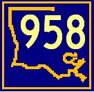
More Louisiana Highway Signs.

I have two other schemes. One is a five-sided cutout shape with the point down, the other is knockoff on the Florida state outline highway route marker.

First the five-pointed cutout scheme.
Purplegold and green: Mardi Gras colors.


This can be for primary State Highways.


And this can be for the secondaries.

Now the state outline scheme.


This first one can be for the primary State Highways.
Again, Purplegold and green.


This second one can be for the secondaries.


This third one can be for the Parish (County) Roads and State Highways given back to the Parishes.
Or, it can be used instead of the ones above for the State Highways.


And this is an example of a hyphenated route in the same colors.

Monday, December 31, 2012

Still More Florida Signs.

This time they're for Florida expressways: freeways and turnpikes.

Freeways. 

Turnpikes.

There are other designs I have submitted to RV Droz's Great International Highway Makeover, but I don't like them as much. I think these are best.

Monday, October 1, 2012

More Florida Signs.

Here are some other signs, small versions of which can be seen at R. V. Droz's The Great International Highway Makeover Florida page.

The first three are one-digit, two-digit and three-digit signs that can be used for state highways of primary importance. The tourist-friendly colors used are azure blue and tropical sea green.


The grey fields represent sky, i.e., the signs are cut-out shapes, not rectangles.

Here we have a state secondary classification and I chose coral red, bright red, dull gold and white with a black border.


And at last we have the county roads ("Pasco" is misspelled. Sorry.) I have a two-tone blue, warning sign Spanish orange, and goldfinch yellow for better visibility especially at night, although Spanish orange is okay in full sunlight.


Come to think of it, white letters with black outline would work better on the primary state route markers above, too.

Tuesday, September 11, 2012

Florida Blue Diamond Revival

Before Florida did its state road reorganization in 1945, it had a different network with different route markers.


Unfortunately, the route markers had the route number in smaller type than the abbreviation "FLA." inside a blue diamond. Of course, that meant the number was not very legible to a motorist passing at 50 miles an hour.

But it's a nice marker and if you shrink the abbreviation and enlarge the number, you can have a uniquely recognisable icon for the state of Florida. Here below are examples for the state and county roads.


Tuesday, September 4, 2012

New Mexico.

Let's get rid of the white circle on the black field and colorize the thing.


This example uses the colors of New Mexico's Centennial series automobile registration plates.

Tuesday, August 21, 2012

Prince Edward Island.

This one is similar to what the province posts now, but with some more colour.

This is the existing route marker. Simple enough. 


This was my first idea. A bit more colour, but no pizzaz


Now this is much better! I like it! I like it! I like it!
Plus, it would remind tourists in the summer, winter and spring to return for autumn.