Saturday, April 2, 2016

Suggestions for E-Z Pass Only / No Cash Lanes.

I sampled some existing E-Z Pass toll lanes signs from off the internet, and I am less than impressed with how they do things up in the Northeast and the Midwest... except for Delaware and Massachusetts; their signs look good with no nonsense.

Mouth of the Sumner Tunnel
Lookin' good, Mass!
Source: metro.us
New Jersey Turnpike
Can you read all this clutter at high speeds? Difficult for me.
Can you figure if the express lanes to the left are tags only? Some people can't! LOL
Source: pixiemap.com

Route 95 Delaware Turnpike
Source: andy-knapp.de

Here in Louisiana, we have a simple "TAGS ONLY" sign over each electronically automatic toll collection (transponders only, no cash accepted) lane.

So here is my suggestion for some of you Toll Road Authorities up north in Yankeeland. ;^)

Tuesday, March 22, 2016

Corporate Limit Boundary Sign!

Usually the corporate limit boundary signs are very boring. They are either simple green-and-white or white-and-black rectangular signs that just don't quite announce that you're entering a city or c crossing into another county. They can very easily be missed. Here is an example, which is about as plain as it can get:


Source: sbsun.mycapture.com

A boring sign in a dreary landscape! (Sorry, Californians.)


Now here is my idea for the several States' corporate limit boundary signs. I have redesigned Massachusetts'  version from white-and-black to green-and-white (The grey is sky, of course.) Basically the redesign keepis the commonwealth-designed present shape and layout, with the participle "ENTERING" bannered in an arc. The rest of the sign possesses the state seal and the city or town's name and date of establishment, just like at present. Other states can have similar signs, with different shapes and data, of course.

In Memoriam

Well the original The Great International Highway Makeover webpage is no longer with us; it was a webpage of RV Droz's US-Highways.com website, which has since been taken down.

If any of the contributors to the old TGIHMO wishes to have their Route Marker Designs up on the internet again, please let me know in the comments section or by emailing me at: ed_miessner@yahoo.com, and please use the banner, "Route Marker Design". (Otherwise I night delete it as junk email, which I get a lot of.)

Thanks!

Monday, March 14, 2016

New New Mexico Route Marker!

No, it's not for real (yet) but it's my latest design for route markers we'd like to see in that state.


The size of the sign is 36" wide by 30" high with 12" high numerals and a 9" high/wide Zuni.

Tuesday, September 8, 2015

It's been very long.

I've had real life problems to solve (more over at my sister blog, Fin Des Voies Rapides (If Peak Oil Is No Object) here on Blogger) and I've also been working on a new highway route marker design for New Mexico, based on their turquoise registration plate. The ones so foar I've grown to hate. Posting soon!

Tuesday, June 16, 2015

Out-of-State Plates 60

USA - SD


Two plates for real, this time. :^)


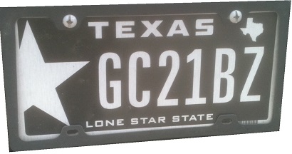
USA - TX

White Lone Star.
 
 
This plate style for some reason reminds me of a joke in a stand-up routine from Second City TV's idea of a communist TV station called 3CP-1, that "broadcast" to the US by "hijacking" 2CTV's signal. The routine was a guy slapping countries sized to the same scale of the USSR and insulting those countries' citizens. Among these he included Texas, with the line, "You Texans, you think you are so big." And slapping Texas onto the map, he shouts, "HA! You are but LONE STAR in Galaxy of Mother Russia!"
 
Still (((( x^D )))) funny unto this very day.